
Inovcares
Role: Research and UI design
Tools: Miro, Figma, pencil and paper
Deliverable: A high fidelity landing page wireframe.

Client brief:
Inovcares came to us with a hunch that their product was not successfully reaching the targeted audience (Latinx and Black women) due to the existing website design. Their hypothesis was that a more conceptualized product would make the difference in attracting these users. InovCares wants a landing page that connects the product with the target audience.
Problem
-
Existing website is not effective in connecting with target audience.
-
Patients and providers need a web portal that clearly communicates the holistic purpose, use, and benefit of the InovCares technology, so they can sign up to use the respective services.
Agile methodology was implemented in this project:
Research
Design
Build
Test
Deploy
Research
Understanding the Users
In an effort to learn more about the needs and concerns of the targeted users, we developed a proto-persona as a guide for which women we should speak to. Our team focused our user research primarily on women that fit in this category, found via our personal networks.
Introducing Mrs. Sara Hampton…

Testing
We conducted moderated usability tests on the existing site to validate the client assumption and discover any unknown pain points. We tested three Black women, two Latinx women, and one White male, and sought to find answers to the following questions:
-
Who would you say this website is for? Describe what about the page makes you think that.
-
What is the website for? What are you supposed to do on this website? Describe what about the page makes you think that.
-
InovCares is a preventative care platform for women, particularly Black and Latinx, that provides access to medical care from your smart phone. On a scale of 1 to 5, with 1 meaning strongly disagree and 5 meaning strongly agree, how would you rate the success of conveying this message?
-
Can you think of a digital product or service that primarily serves women of color? Describe how the product successfully communicates that they are primarily for women of color.
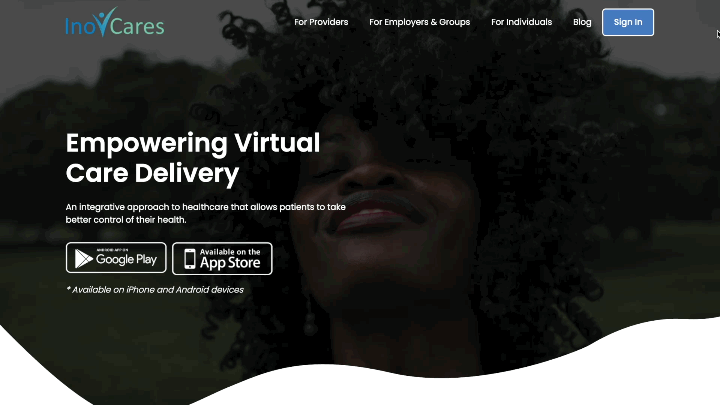
Moderated testing was first conducted on the existing site above.
Affinity Map Key Insights:
-
Users were not clear about the site purpose.
-
Users could not tell from the site design that there was a target demographic.

"The site is for if you have a problem, you can go to this site to get virtual care."
"The image is an afterthought. Nothing about the website's current info would make me think this is for Black or Latinx women."
Charette Sketch Session

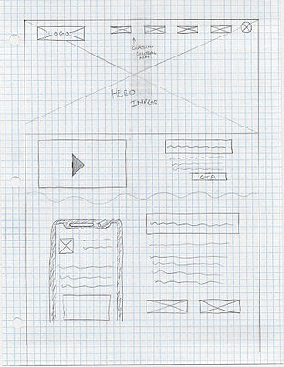


clear product description using icons
sticky nav
hero image of woman of color
hero image of woman of color
how it works
hero image of woman of color
product description
gradient global nav
Designer 1.
Designer 2.
Designer 3.

hero image of woman of color
clear product description using icons
how it works video
testimonials about the app
input blog/newsletter CTA
Collaborative sketch compilation.
Design Solutions
-
Include images of people of color.
-
Less copy, more icons/infographics
-
Project pivot-- Mid-design we discovered that our re-design didn’t resolve the problem the users had with not being able to distinguish between if the website was for providers or patients. We decided that it would be best to create a separate patient portal landing page.
-
Include Mohammed’s compelling story to connect with the target audience.
Build
Initial Wireframe Draft
Provider Landing Page
.jpg)
hero image of woman of color, representing target user
description of who the service is for
video of how to use the service
benefits of using the service
provider testimonials
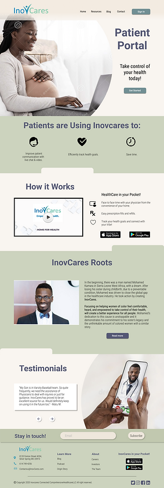
Patient Landing Page
.png)
hero image of woman of color, representing target user
description of who the service is for, and the benefits of using the service
video of how to use the service
compelling story of origin
patient testimonials
Test
We conducted moderated usability tests on our re-design. We tested three Black women and three black males, and sought to find answers to the following questions:
-
Who would you say this website is for? Can you describe what about the page makes you think that?
-
What is the website for? What are you supposed to do on this website? Can you describe what about the page makes you think that?
-
And general feedback or thoughts on the website?
User Testing Key Insights:
-
Users were able to clearly identify the site purpose.
-
Users identified the target audience in alignment with the business goal.
-
Color scheme was not captivating to the users.
"The website is for women or people of color facing preventable health issues or diseases."
"This website is to download a one stop shop health care app that lets you schedule remote video chat doctor appointments with someone who’s relatable and it tracks your health information."
Build
Second Iteration
Provider Landing Page

Patient Landing Page
.png)
new color scheme
new color scheme
expanded benefits of service
Deploy


Style Guide
